
Here it is! The how to video everyone’s been asking for! I hope to film every weekend now that I have a dedicated space. Let me know what you think!
Make Time to Create: Week 1 (video)

Last week, I set out to work in my art journal for 10 minutes every day. For the first 4 days, I was able to live-stream my journal time over on Facebook live, which has been an amazing experience.
I decided to stream via my personal page (note that you can still see the streams if you're subscribed to me; we don't need to be "friends") when I learned Instagram doesn't save live video, and couldn't figure out how to do it via my art page. This little decision worked to my advantage, because I found that, in addition to all my artsy friends, my non-artsy friends, coworkers, and family popped in to see what I was doing and say hi! While I talk about and share my art with everyone in my life, it was awesome to see them take an interest in what I was doing.
In addition, artsy friends were able to give me suggestions and ask questions while I was working - I like to say this is our spread, because so many were on-hand to help make it!
I've decided to keep going and see how long I can keep up this momentum. I'll also be editing together all the streams to make one nice, long YouTube video that I'll post at the beginning of the next week. Let's see how long I can keep going with this! Cause it's tons of fun!
Don't forget - I'm still posting daily vids on Instagram each weekday morning!
Understanding Color
Starting this year, I'll be writing art journaling posts for the lovely and wonderful Alisa Burke! Here's my first post - and I'll be posting a LOT MORE in 2017, so stick around: this girl is back to business!

Experimenting with color is one of my favorite things about art journaling, if not the favorite.
I come from a more technical & word-y background, and while I often played with watercolors as a kid with my mom, I never considered myself capable of being an artist. When I began art journaling, I really had to learn the basics, and recalled the simple lessons from elementary school art class - the color wheel, warm and cold, all mixed together makes mud. These are great to get you started, but all the books in the world won't compare to what you can discover with the spirit of experimentation.
I really am a 'what if?' Kind of person. What if I combined this with this? What if I used this tool differently? All the techniques you love were once ideas in the heads of artists past, and you have that same power of creation.
Apply this same idea to color. It isn't a mystical force to be feared, but a friend who brightens your day. But you need to learn your own color language first!
Why is this important? I'll tell you a story. Ages ago, I saw that I was using a lot of the same colors in my journals, and thought that didn't make me a well-rounded artist. I told myself I had to start using the colors I usually shied away from, and proceeded to use the yellows and greens I didn't like. And surprise! I hated those journal pages. There were great parts, but I just didn't like them. I lost my mojo. I thought I was a bad artist.
But I wasn't. I knew what I liked and what I didn't like, and if I want to do turquoise on all my pages, then I can do that. Your art journal is for YOU and no one else.
Here's an exercise for you: start a color journal.

I like to find new color combinations through a simple exercise I inadvertently discovered.

You'll need 6 colors, plus some good white. You want to pick warm or cool as your primary palette. Here's what you're looking for:

- White
- Black
- Neon shade complementary to primary colors (warm if cool, and vise versa)
- Light shade complementary to primary colors (warm if cool, and vise versa)
- Light
- Medium
- Dark
Remember that mixed warm and cool colors will make icky mud, so try not to layer while too wet. Use the primary three colors first, using the neon and light complementary shades to add accents (in the example below, the neon pink and yellow are to be used as accents).
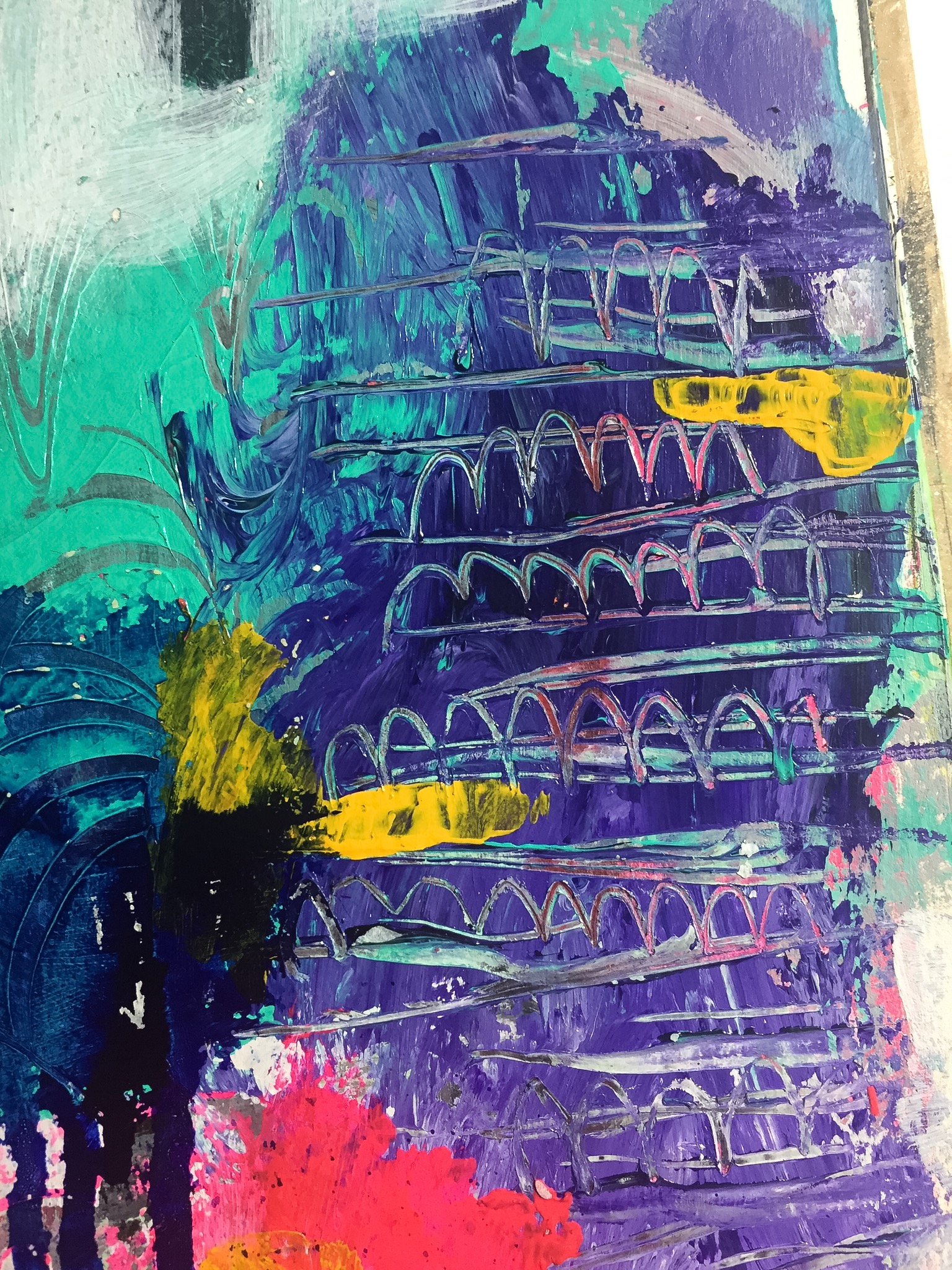
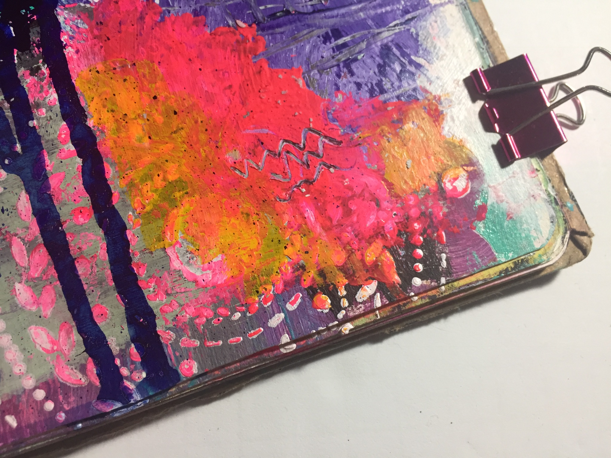
Switch out primary colors - go more blue, or green! Do reds or pinks! But remember your accents and black and white to add contrast and depth to your spread.
I've done this through an entire journal, which I now can pull out whenever I'm trying to figure out what a page is missing, or what colors I should choose to compliment a new favorite.
Doing these kinds of exercises helps build up your color library and helps you to create awesome journal pages!
