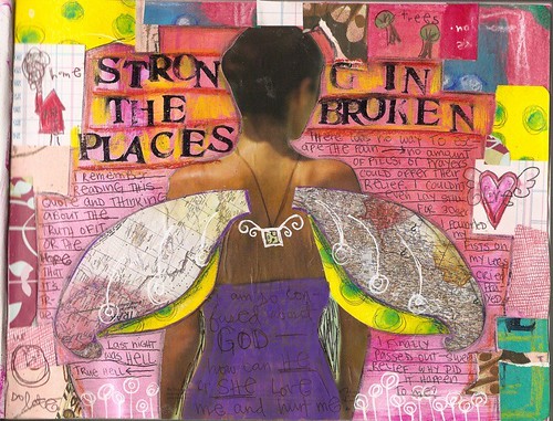
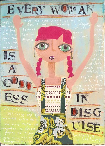
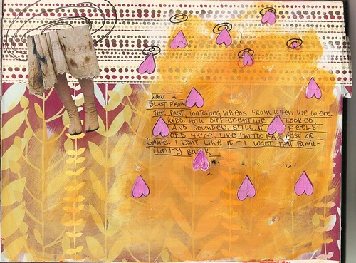
of course, all those words are relative to your appreciation of beauty. to me, they're loose "labels" i apply to my feelings when i finish a piece. "good" brings a smile to my face, and i can't help but gaze at the page or painting lovingly. it's probably in display on my walls (or a copy is, if its a journal page), a constant source of inspiration and admiration. it's taken me a long time to appreciate my own work, and even longer to accept that others may as well. for those reasons, i like to surround myself with personal works that are "good."
"bad" brings a sense of unease to my stomach. it means i'm not happy with how something turned out, but at least i learned something. like how to make eyes how i like, or to do the background first, or that i need a certain sized brush. like they say, in order to make good art, you need to make lots of bad art. and that's why "bad" doesn't necessarily mean bad, it just means, "so you're not happy, but at least you learned something from this experience." i never rip journal entries from my journal, so they serve as a reminder of that lesson. they also go on the wall.
"ugly" is just plain ugly. unease coupled with nothing new. i rarely make these pieces anymore, but when i was starting out, i just kept making the same sorts of things because other people were making stuff i liked, and by doing the same thing over and over again and expecting different results is crazy, ya know?
i am so anti-caps today! *laughs*
i've been doing something creative every day, which has me happy and learning to my heart's content. i'm also trying to watch less tv, so please, give me ideas! here's how it works:
i'll take commissions for journals (hand-made and any size/paper you want!), paintings, and videos. yes, videos! the price will be whatever you believe your commission is worth (plus materials for journals), as we'll both be getting something out of the agreement.
i find i spend a lot of time watching tv thinking, "i don't like this show. i should go read/make art/work on the 'zine/etc." but i never do. so i need a little prompting, k?
here's a journal page i'm totally head over heels over!
i've put notes on it on flickr to show you the papers i used around the edge, etc. i always see pretty entries with colorful paper borders and never knew what they used! so here's my help to you! (just click on the image)
and here's my less-than-stellar painting/loose journal page (is there a difference?):
i love the background and the white pen & handwriting. i love her eyes. i learned how to make arms. i painted her directly on the paper instead of making her somewhere else, editing, and cutting her out. while i had more freedom that way, i wanted to try doing it the "right way." oh, she looks tired. there's just not the expression in the eyes i was aiming for. and the stamping's all unflattering. but that's my opinion. you may love it. at least we'll all learn from it (as we do learn from every piece of art we see!).
you may have noticed my journal entries are landscape. i found that i love working in that format, but that doing spreads across two pages sometimes made it so the pages no longer laid flat (the left-hand page would curl from all the stuff added onto the pages before). my solution? a landscape sketchbook. was expensive and i had to go down to blick for it, but i'm in love. now i can make spreads without the line from the center of the journal going through them. no more bulging pages. i only use the right-hand pages in it, but hey -- it's my journal! i do adore it so and think i've found my perfect journal.
off to work on some more swatch papers. more on that later!

PS. I have an AIM/iChat name if you'd like to say hi! journalgirlkira


