
More experiments in my giant art journal with color.
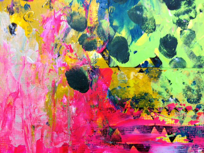
Color theory and an intense dislike of any red and green next to each other for things other than Christmas would have told me not to pair a light lime green with neon pink, but as I wanted to see how colors work next to each other, I decided to just go with it and see what happened.


I kept many of the colors I'd already been using, but added the aforementioned lime green, neon pink, cobalt turquoise and permanent violet dark (Golden fluid).
And I have to say, putting out a palette of colors and smashing them across my art journal spread is incredibly satisfied. I put on my playlist and just get to it. I find myself laughing out loud, getting my hands incredibly covered in paint, and try making new marks in the paint with my various tools. I think the scallop shape in the above image is my new favorite -- that and the chevrons were made with the same tool; I just moved my hand differently.
When I started this spread, I stamped onto the page with my hand-carved stamps and India ink -- it doesn't spread or smudge when you work over it -- and glued down random found papers. I love how you can see them through the stuff I drew into wet paint, a kind of half-seen text that lends to a sense of mystery.

To say I had fun is an understatement. This spread is so textured, you can feel all the lines and thicker splotches of paint. And remember, open, this journal is 22"x14". HUGE! Full of a color explosion and tons of experimenting. I learned I love neon red & pink mixed together and my little hearts stamp and drawing in paint. Making dots with my fingers (and the sound they make as I dapple paint).
I don't think I'll add anything, because I love it how it is. All chaotic and fun and yeah. Imagine me sighing blissfully over here. I did a small 6"x8" canvas with this palette, too, and think I'll write a quote on it when I find the right one.

What do you think I should write on this one? Suggest some quotes for me in comments, please?
PS. I'm loving my 30 day challenge blog/class. My students are drawing so awesomely, I can't help but be proud.