It's been no secret that I've been learning color theory in my art journals.
You see, I didn't really pay attention to it until I was taking a tour of the Phoenix Art Museum with Dina and listened to her speak about color usage by the great artists and their contemporaries; she'd point out the importance of the red chair or diary in a painting, about how colors work harmoniously together, and her words swirled around me, my heart aching to create art that spoke on so many levels.
Even if you're just playing in your art journal, wouldn't it be wonderful to just know which colors would work together? It would take a lot of the guess work out of painting -- you could then focus on content and message and collage, rather than hoping the colors you chose would look awesome together.
At least that's my thinking!
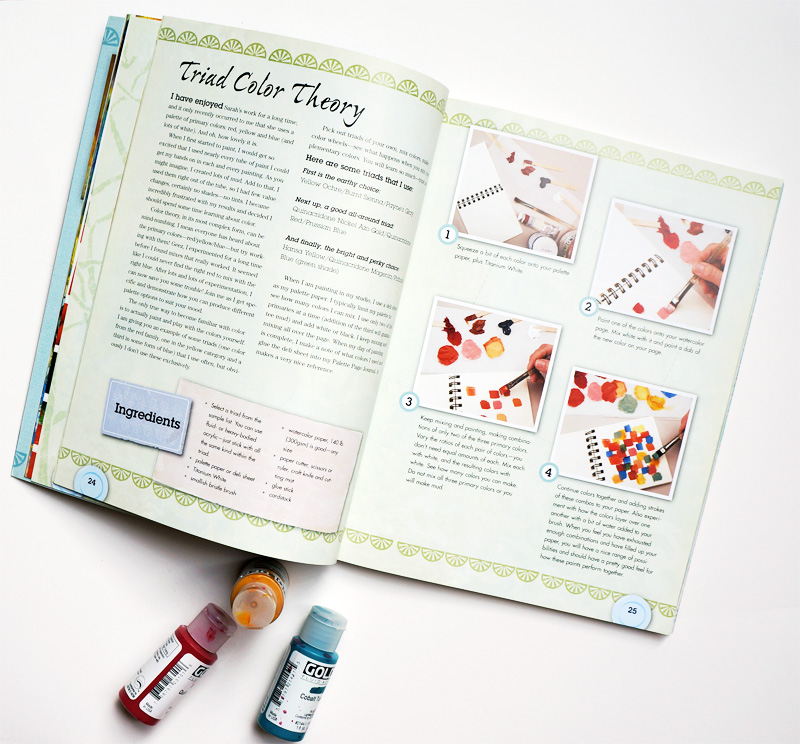
I've been mixing colors for years, but have never stretched myself as far as when I did this exercise in Mary Beth Shaw's book, Flavor for Mixed Media.
This book, while like many of our modern how-to books, surprised me with the variety of techniques and exercises within; each is inspired by the work of other artists, meaning you get lots of interviews and insights to our favorite art-makers out there! Add to that recipes for yummy food, and you have a wholly unique book on your hands.
In this exercise, Mary Beth encourages you to get to know your colors better. By choosing three colors: a red, yellow, and blue (plus white), you then mix two of them together in all the ratios you can think of...and there are a LOT of colors you can create with just three shades of the basic colors! I thought I'd be doing a couple mixtures, but each just went deeper and deeper as I played around. Not only do you discover new colors, but you suddenly have a whole palette of harmonious colors you know will go together, all from three little bottles. I can't wait to make journal pages from these experimental pages & colors!
I really encourage you to give this a try and record your results. I mixed my colors on deli paper, as Mary Beth does in the exercise, recording the colors I used with a Stabilo All pencil. I worked on watercolor paper, making little squares with an angled brush (but you can make circles or rectangles!) .
You'll really stretch your own understanding of color and mixing, and the whole process is so calming, it's a perfect warm-up exercise to a rewarding session with your art journal! You can even glue the results in!
This is my earthy palette, and the first I tried. Your yellow doesn't need to be bright yellow, but can be a shade. Look at that dreamy purple over there on the right!
I was really astounded by the range of colors created from these primaries. The Nickel Azo gold may not seem like a yellow, but it is...gold!
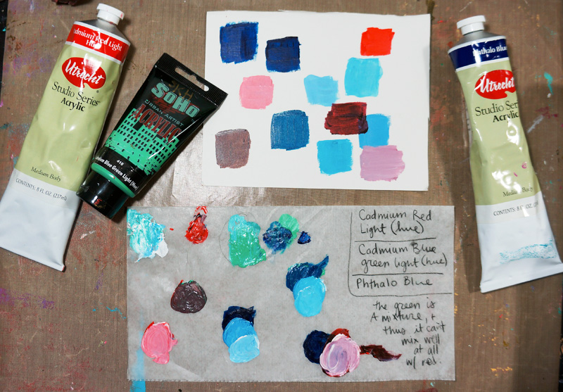
I wanted to show you my mistake batch....I forgot a yellow, and threw in a green instead, and yeah....it doesn't work really well! Oops!
This, by far, was my absolute favorite of the four....just looking at the mixture sheet makes me happy! Expect to see a journal page covered in these colors real soon over on my Instagram account! Mmm! Mint! And lime green! And a warm pink! Yummy!
Also, I wanted to let you know I've created a little vlog YouTube channel called JournalGirlStudio. I really love making those short check-in videos from my studio (I've even made little ones and sent them to friends!) and thought I'd throw 'em up on YouTube. That way, you can just see what I'm up to whenever you want without having to be on Instagram or Facebook. They'll all be made from my iPhone....so let's see how this goes!


