Check out my first tutorial for the StencilGirl Design Team over on StencilGirl Talk, our new blog! There are some awesome tutorials over there already and it's only our first week!
I even made a little video. Go on, you know you want to!
Your Custom Text Here
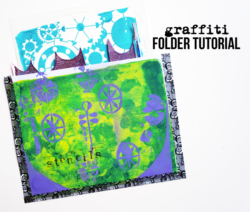
Check out my first tutorial for the StencilGirl Design Team over on StencilGirl Talk, our new blog! There are some awesome tutorials over there already and it's only our first week!
I even made a little video. Go on, you know you want to!

I've run away to the mountains.
Needing a little break, I've headed up to Jerome, AZ, to enjoy some alone time, beautiful mountain vistas (look at that view of the valley, and the mountains on the other side - gorgeous!), walk around town, and create some art.
Why don't you watch a little studio video from yesterday while I'm away?

Also, I have a summer camp announcement!
Summer camp dates have changed: Camp will now run from August 5 - August 18.
I felt this would allow more people to join us & me more time to cultivate space and interviews. I'll be posting sample artwork & revealing the artists in the coming weeks on Fridays. I hope you can now join in on the fun!

Disappointed with the paper quality in the new Moleskine sketchbooks, I decided to make my own pocket journal.
I really loved working in my latest Moleskine journal, falling in love, again, with the smaller size. But when the paper in the newer one I bought didn't live up to my 4 year old filled one, I needed to figure out another solution.

And then I found this amazing watercolor paper pad! Beautiful Fabriano hot press watercolor paper, all for $30. I couldn't believe my good luck -- I've never been able to afford any hot press paper but like everyone else in the art journaling world, I've heard how amazing it is. So I grabbed this thick pad, brought it home, and stroked it gently as I dreamed of beautiful journals of the future and painting upon its ultra-smooth surface.
I'm sure I'm not the only one who hugs her journals, pens, and paints!
The night I brought this magic home, I decided to create a new pocket journal from it!

I bound it with some hemp thread I waxed myself through a binding of bookcloth....I wanted to just have a simple journal I could throw in my bag or pull out to play with collage in (though my friend Sandie says you should put a thin piece of board inside the spine to make it more solid).
Want to make a journal like this for yourself? Check out these tutorial videos I made a couple of years ago....I used the same process to bind this as I did in my Easy Peasy Journal!
(Wow. I think it's time for a new binding video!)
Here are a few pages I've already done in my little pocket journal. It's so much fun to have around and play in! And a great way to always have your art journal with you!


Don't forget -- Art Journal Summer Camp starts in just over a week! Two weeks of daily tutorial videos, artist interviews, & more! I'll be revealing our guest interviewees next week!
Perfect for the art journaler who wants to learn something new & meet new friends without having to commit to a large class. :)

I am so excited to present to you my newest online course, Art Journal Summer Camp!
Two weeks of daily video tutorials, right to your inbox. An archive on the ning site. A Facebook group to meet your fellow campers. Learn more in the video below, and then, click on over to read all the juicy details!
I want to also give away two full sessions!! Simply leave a comment below to be entered and tell me what YOU love most about summer camp!
The giveaway will be open until Wednesday, July 10th! Tell your friends and I wish you luck!

It's been no secret that I've been learning color theory in my art journals.
You see, I didn't really pay attention to it until I was taking a tour of the Phoenix Art Museum with Dina and listened to her speak about color usage by the great artists and their contemporaries; she'd point out the importance of the red chair or diary in a painting, about how colors work harmoniously together, and her words swirled around me, my heart aching to create art that spoke on so many levels.
Even if you're just playing in your art journal, wouldn't it be wonderful to just know which colors would work together? It would take a lot of the guess work out of painting -- you could then focus on content and message and collage, rather than hoping the colors you chose would look awesome together.
At least that's my thinking!
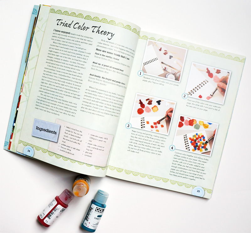
I've been mixing colors for years, but have never stretched myself as far as when I did this exercise in Mary Beth Shaw's book, Flavor for Mixed Media.
This book, while like many of our modern how-to books, surprised me with the variety of techniques and exercises within; each is inspired by the work of other artists, meaning you get lots of interviews and insights to our favorite art-makers out there! Add to that recipes for yummy food, and you have a wholly unique book on your hands.
In this exercise, Mary Beth encourages you to get to know your colors better. By choosing three colors: a red, yellow, and blue (plus white), you then mix two of them together in all the ratios you can think of...and there are a LOT of colors you can create with just three shades of the basic colors! I thought I'd be doing a couple mixtures, but each just went deeper and deeper as I played around. Not only do you discover new colors, but you suddenly have a whole palette of harmonious colors you know will go together, all from three little bottles. I can't wait to make journal pages from these experimental pages & colors!
I really encourage you to give this a try and record your results. I mixed my colors on deli paper, as Mary Beth does in the exercise, recording the colors I used with a Stabilo All pencil. I worked on watercolor paper, making little squares with an angled brush (but you can make circles or rectangles!) .
You'll really stretch your own understanding of color and mixing, and the whole process is so calming, it's a perfect warm-up exercise to a rewarding session with your art journal! You can even glue the results in!

This is my earthy palette, and the first I tried. Your yellow doesn't need to be bright yellow, but can be a shade. Look at that dreamy purple over there on the right!

I was really astounded by the range of colors created from these primaries. The Nickel Azo gold may not seem like a yellow, but it is...gold!
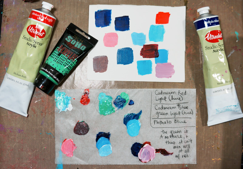
I wanted to show you my mistake batch....I forgot a yellow, and threw in a green instead, and yeah....it doesn't work really well! Oops!

This, by far, was my absolute favorite of the four....just looking at the mixture sheet makes me happy! Expect to see a journal page covered in these colors real soon over on my Instagram account! Mmm! Mint! And lime green! And a warm pink! Yummy!
Also, I wanted to let you know I've created a little vlog YouTube channel called JournalGirlStudio. I really love making those short check-in videos from my studio (I've even made little ones and sent them to friends!) and thought I'd throw 'em up on YouTube. That way, you can just see what I'm up to whenever you want without having to be on Instagram or Facebook. They'll all be made from my iPhone....so let's see how this goes!
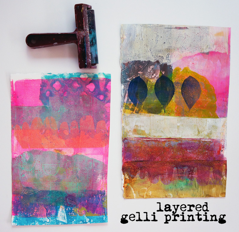
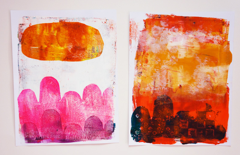
After a couple of days of a lack of painting mojo, I decided to pull out my gelli plate and play around. I knew once I got into the steady motion of spreading color, putting down stencils, and pulling up prints, I'd begin to feel myself again, inspired and calmed by this simple tool.
I knew I wanted to do something different than what I'd done before, playing more with color and shape than I did by throwing stencils down on the plate. While I've done a couple of things where I didn't print the entire page with each pass, I'd never done it across several papers, and was intrigued by seeing Jane Davis' videos of shapes on YouTube and Carla Sonheim's blog posts (I've since taken her class...I have one video left to watch, but highly recommend it if you're into more artistic prints, like me).

I cut a lot of my own stencils & used a couple by StencilGirl (they're hosting a giveaway over there, where you can win a gelli plate & stencils...go enter now!) . I wanted to use them differently, and tried a couple new things as I layered and layered paint.
Usually I print on cardstock -- it's plentiful and cheap, in case I make a print I don't like. And that's the mindset I had...that I'd just put down paint and random stencils and see how things came out. I see now that was a narrow view, and left a lot more to chance than I was comfortable with. While I'm all for intuitive art, and often paint without a destination in mind, I have learned skills and style to help guide me.
This time, however, I spied a sheet of Arches hot press watercolor paper I'd found at Michael's on clearance (check your local store; it was 50% off!) and decided to cut it down to letter-sized sheets to try on the gelli plate. It made a huge difference! I was able to pick up so many more prints from each plate of paint, and was able to use more water to create watercolor-like layers at the very end.
I won't be using cardstock again! It's watercolor paper from now on!

Here are a couple of things I learned/loved:
There's a bunch more, and I could probably write a whole blog post on each of those bullet points, but yum, I am in LOVE with the prints I made over the past two nights! They're vastly different than what I've made before and feel more organic, vivid, and just....arg! I wish I had a word for how HAPPY I am seeing these beautiful things I've made!
I'm thinking of putting a couple up in my Etsy shop; still deciding if I can part with any of these!
Here are the rest of them! (My fav remain those in the header image up there!)


And me at work!
BTW, I've been posting these little <1 minute videos on my Facebook page & Twitter account as a "check in" to share what I've been working on and ask you what you're up to. They're really fun to make, and are informal little things inspired by the new video feature on Instagram; am considering posting them here, or putting them together for a weekly thing....I don't know yet! Just know that they're there!

I shared this spread in progress over on Instagram, and it got lots of love! I was relaxing with my art journal after a long day oil painting and decided to play with shape, pattern, and color.
I started by grabbing about 8 colors and squeezing them onto my palette. I then sponged through a couple stencils, glued down a piece of patterned paper, and got to work just....making marks!

These were the first thing I drew, outlining them with some more lines. The neon and marks were added later with paint pens.
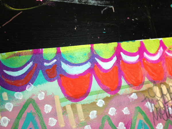
More doodles. Scallops this time! Colored with some neon paint and those new Silk acrylic glazes. The dots were made with a q-tip, a little trick I learned from Connie the last time I was at her place!


And here's what the entire spread looks like! I just love looking at....so much going on! I was using my paintbrushes in new ways, putting down color after color, and then adding more with pens and ink.
When was the last time you played with repetitive patterns? Do you give into the urges to draw random things, or do you feel like you have to stick to a plan?

This recent spread in my art journal is one of my favorite things right now.
1. I like that there's a white border around the pages.
2. Texture & blocks of color!
3. The pasted bits from my collage sheets.
4. The dark color on the bottom of the right-hand page and the landscape painted on there in blue that's mirrored above.
5. The writing of story with an ink brush.
I've been painting lately, working with my oils after a few days away, so I have it out now as I sit on the couch. There are fluid acrylics in a box next to me, a scrapbooking tote filled with acrylics in front of the couch, random bits and stamps on the floor that makes getting up near impossible. I want to collage and sketch and lay down color in a bright mess, rebelling against the strict lines of my painting earlier.
This spread is also in my Strathmore mixed media art journal. I adore this paper to no end. It takes every media so well, never gets wavy or stays curled on itself, and is tough . I can't sing its praises enough. Whether I use watercolors or acrylics, I never have to gesso.
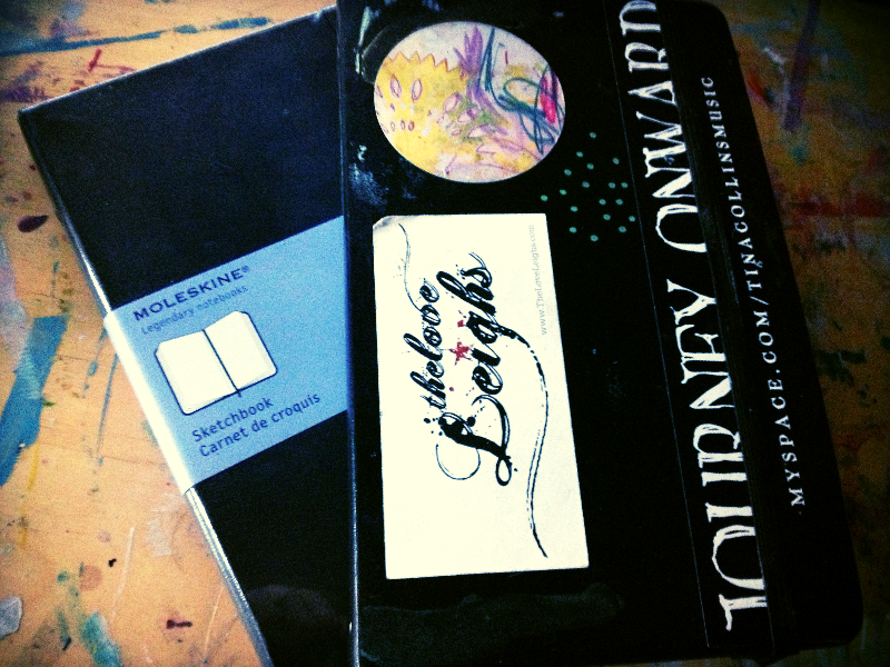
Thanks to a coupon at Utrecht, I was able to replace my full Moleskine sketchbook with a new one. I noticed something different with the new one, though, and wonder if you've also observed a difference in quality; the paper seems a little thinner and the cover feels...weird. The one I was using before was from about 4 or 5 years ago. We'll see. I still love it. There's just something about the size and paper that makes me want to collage and draw with my paint markers.
I've all but converted my Dylusions journal into a sketchbook. I endeavor to draw one face a day in it, and am loving what I've been able to draw! The paper in it is thinner, and whenever I try to use stuff on it, it buckles or curls. Watercolors just do not work in it. I was really sad when I discovered that. But it's smooth and is wonderful under a pencil or ink, so I write and draw and doodle ideas in it.

In super happy fun news, I have two things to share with you!

The June issue of warrior call is now available!
In this issue, we discuss cultivating awareness & how it helps us to distract ourselves from stress, chronic illness, or whatever else keeps us from being creative. There are a couple essays in there, photos galore, journal prompts with examples, 2 guest pieces, and a project that will definitely help you create the life you wish to live!
I'll also be opening up a discussion forum for this issue on the Ning for you to chat about awareness, share your thoughts, and post art!
I've also decided that anyone who supports the new economy will receive a complimentary issue every month as my way of saying thanks for being brave and supporting the work...your patronage means the world to me!
The self-study version of Digital Adventures is now up and ready for you to join!
This class is jam-packed with instruction and ideas for you to take your iPad art journaling to the next level. We had such an awesome time in the live class -- I just adored seeing my students progress, and was able to watch them improve and deepen their digital art journaling. I made it so easy and answered so many of your questions.
There are over 20 HD videos with 5+ hours of content just waiting for you to take the leap. Add to that digital goodies, shared files, examples, and more!
